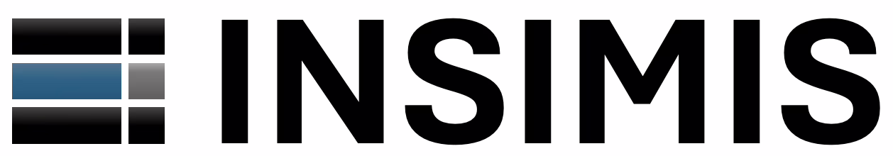

Over the past few days, the spirit of creating the INSIMIS project logo prevailed. The idea of simplicity, clean lines, and timelessness matured in our mind. The resulting combination of simple geometric regular shapes reminiscent of a trio of lying letters ‘I’ that you can see in the project name. The logo can also resemble a trio of exclamation marks, reflects the distinctive landscape in which this project was born. In the realm of imagination, one might even see three solid server disks stacked in the logo, as this project is strongly influenced by information technologies. Or perhaps the logo depicts a shelf full of deliveries for our customers? Regardless, it’s certain that the logo features a beloved color combination that we appreciate. What do you think?